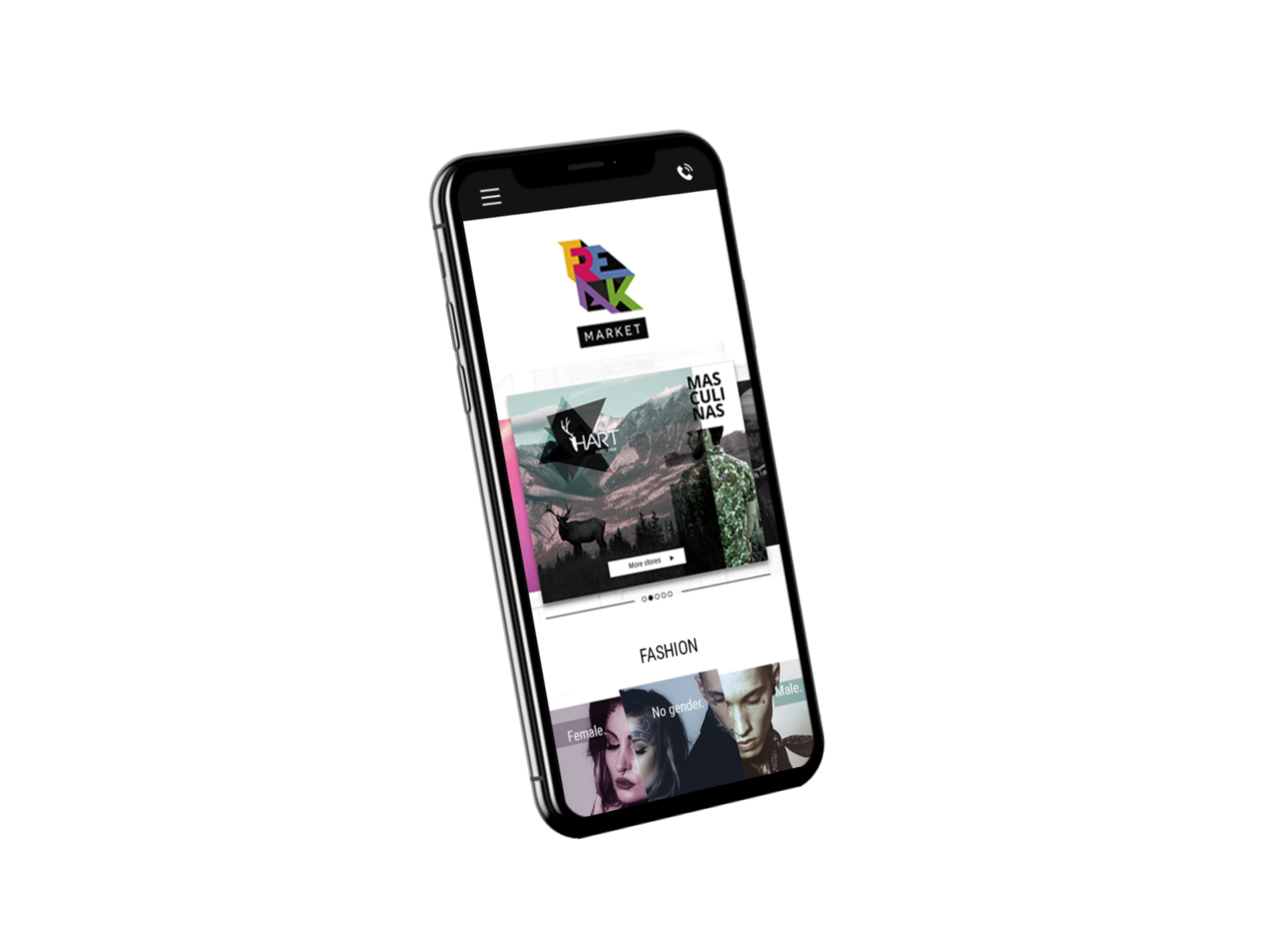
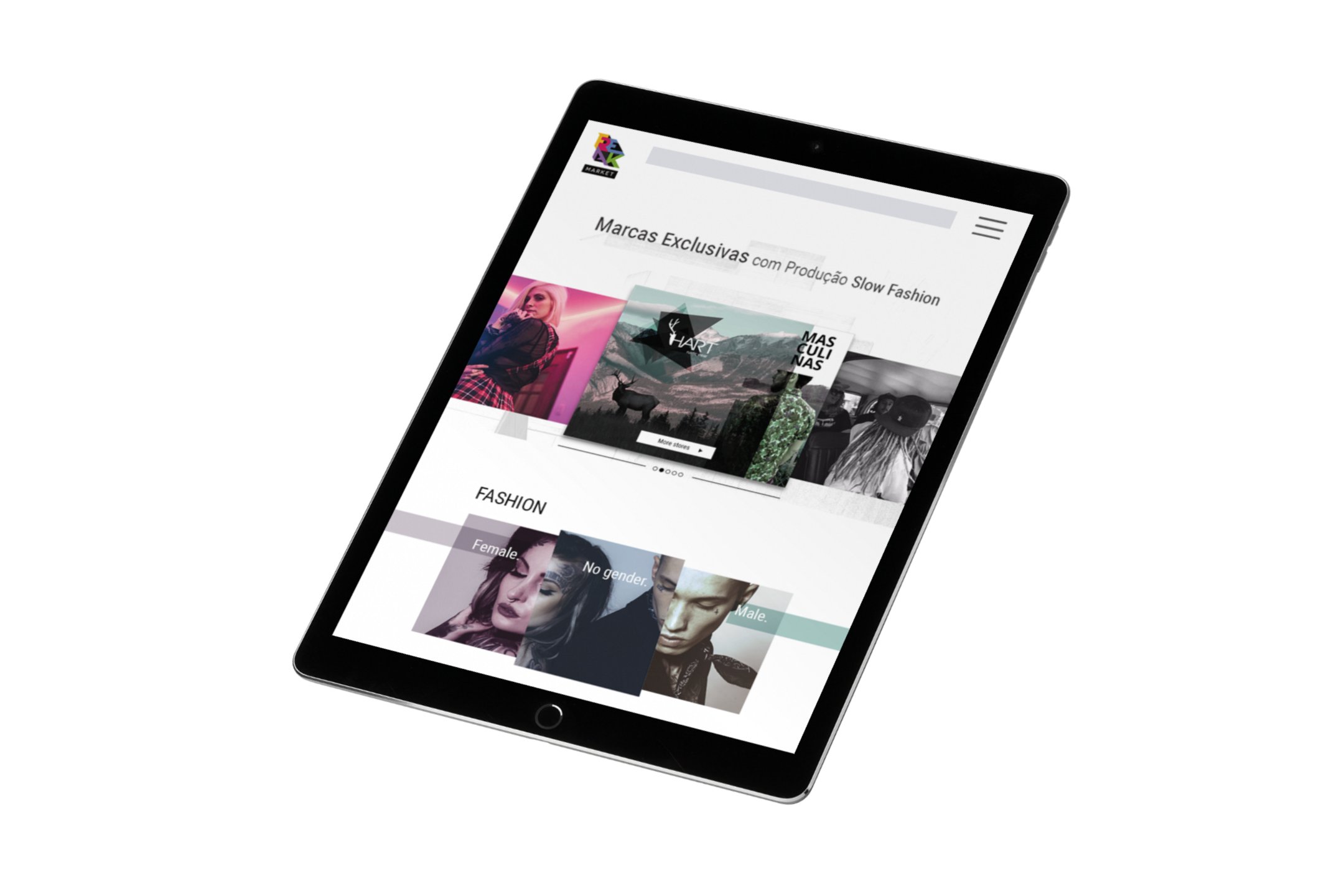
Main page
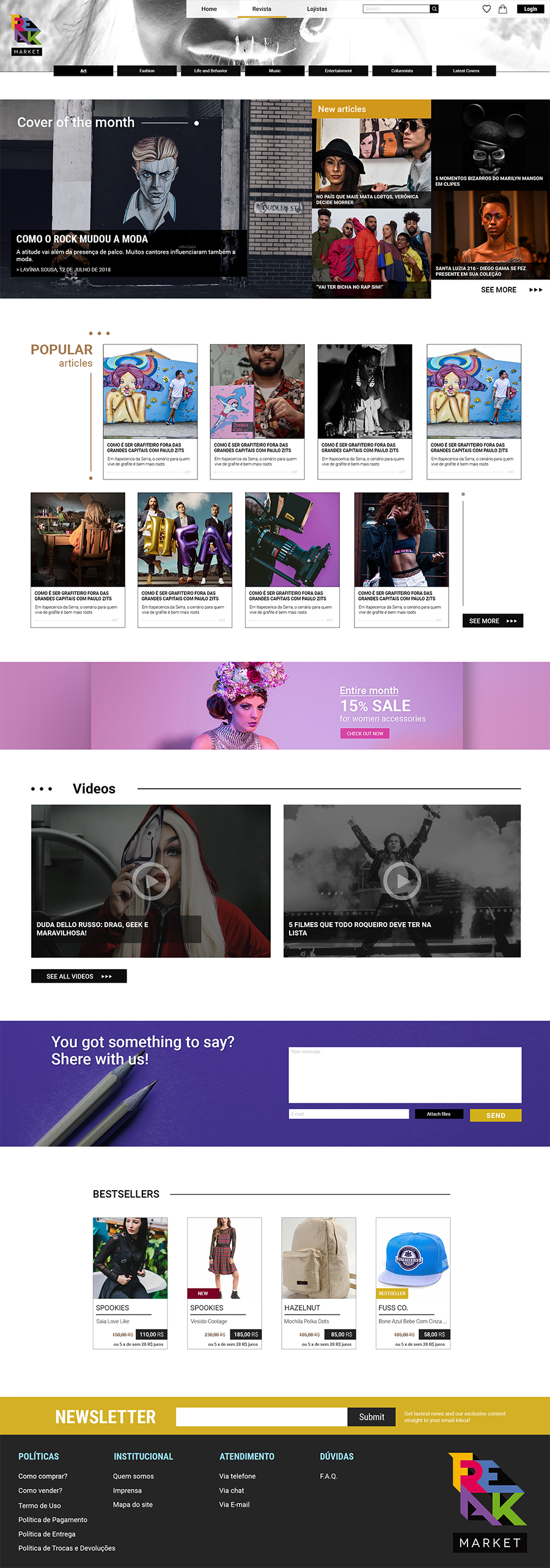
The home page was a part of the 99design.com contest, so client gives all contestants more space to express themselves. They do not restrict the possibilities too much because they want to receive materials that compact with the freak philosophy and do not just stay within the conventional. Of course, some sections were imposed by the client and some by the rules of e-commerce type of existence. So the main challenge was to find some kind of “Freak” spirit and transformed into a visual form of the website.
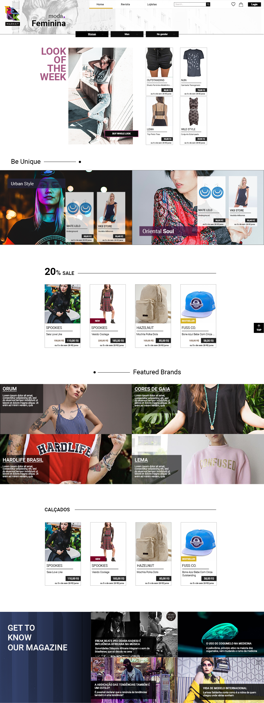
Classic carousel on the e-commerce sites, but showed in a little unusual way. We seeing three of five different brands promoted on this page. The main one is highlighted by an increased size.
The main menu was not divided for only two main genders, but for three. The first time I read about this, my first thought was to use one picture for all three types. So, I did it.
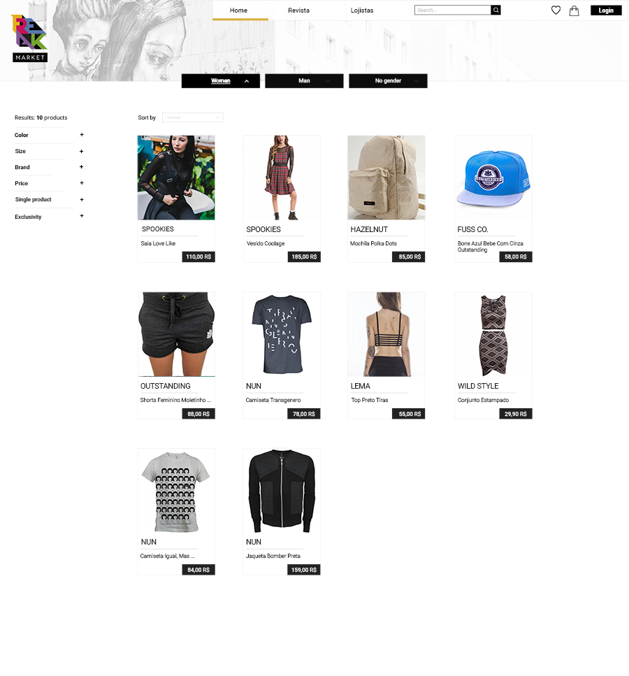
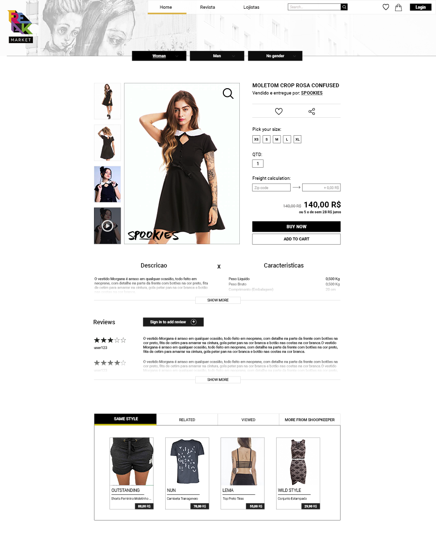
A standard form of showing products on e-commerce websites. I must create a clear, minimal style card for best user experience, but something matched to the “Freak” style.
By the way, it was pretty challenging to use some standard business forms of the e-commerce website, without destroying unconventional ambitions of the Freak Market.
For a cloth business, targeted on young people, Freak market should have a strong social background, highlighted from the beginning. These part looks like is not in this book, but this makes it more interesting and fits perfectly into the convention of the whole site.

